Visual Abstract attempt
In response to Greg Wilson’s challenge, I did a quick attempt at a Visual Abstract for a recent paper.
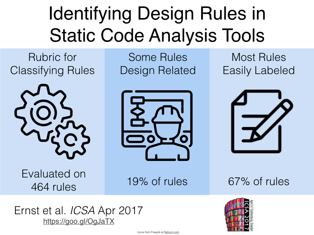
I think it turned out ok; it captures the core findings and presumably will prompt people to look at the paper. I’ve attached the Keynote slide I used in a repo on Github.
A few comments:
- Graphic design is a skill you need to work on (duh). Even with this template, I don’t think it is super compelling. I just used out of the box icons.
- The footer kinda loses relevance when you don’t have a big name JOURNAL behind you. Something else can go there. I used the conference logo, but maybe some logo for your lab.
- I wanted a URL to point to the full paper, but a bar code might be better. If anyone uses that anymore.
- For qualitative papers, and maybe software engineering in general, the “outcome data” at the bottom is more difficult to come up with. I don’t know if I can easily pull three nuggets of improvement for each paper (but I hear Greg’s baritone susurration saying “well yes, that’s part of the problem”)
- As someone on Twitter pointed out, these are intrinsically visual and thus not accessible to the visually impaired. I do think they help the “academicese-impaired”, but each time one of these is used, I would hope a non-visual summary is also presented. Pulling the text together shouldn’t be too hard. I’ve had a go in the “alt” text above.
- Doing a whole batch of these (say for an ICSE track) would be a fair bit of work. Presumably you could pick papers you’ve had to read anyway (and cared about). But summarizing the contributions is not so simple (for me, anyway). Again, perhaps that points to a wider problem.
I’ve noticed more and more papers calling out contributions in special boxes, and bulleted lists in the introduction. I think this is great. One of my pet peeves is a reviewer who points out some trivial English error, but tolerates the total incoherence of the introduction.
Related to this is a visual portrayal of the methodology. This happens a lot in medicine, where lots of experiments are conducted and explaining complex cross-over designs is important. But you can see a similar example in Borg et al. 2017, below:
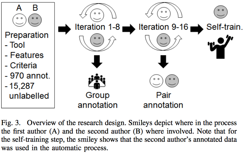
This explains how the study was conducted. Again, anything that can explain what is going on for a busy reviewer is helpful. Remember, in 2017 FSE reviewers seem to have reviewed 25-28 papers each. Expecting them to spend more than 30-45 minutes on each one is unrealistic. So make your time with them count!